Tuesday, March 29, 2011

1i. Completing the Painting

This is my last post on this painting. Okay, stop applauding...

I have now completed all the detail work on the boats and background and ready to complete the reflections on the water just under the boats.


Again, I worked from left to right in putting in and correcting the reflections in the water. I have to stand back and look at the objects and then look down at the reflections to make sure they look right. I am not afraid to make changes at this point.

The reflections are more distinct the closer to the object, and then lose some of their color and start breaking apart as they come to the viewer. The photo for this painting was taken from across the harbor, so the perspective on the reflections become very horizontal.

As a rule, reflections that come from an object that is actually touching the water will be the exact same distance from top to bottom as the object. I use my brush to do a quick check on this by placing the brush in front of the object and put my finger on the distance. Then, I move the brush down and see if the reflection is ending at the right distance. The more the water is breaking the reflection the more this distance can change slightly as a little wave or two is catching the reflection of the object beyond the correct distance. If the water is perfectly still, the distance would be exactly the same.


By comparison, the commissioned painting above, titled, "Second Born," came from a photo I took standing on the boat launch dock at Conn Brown Harbor in Aransas Pass, Texas. I was only about 50 feet from the boat and the reflections came right up to me and were very pure. There wasn't the distance to break up the reflections very much, even though there were modulations on the water surface.


Here is a cropped view of the same painting showing how I was able to achieve looking through the water at the algae covered rocks under the surface. The reflection of the pole was still distinct because I was very close.

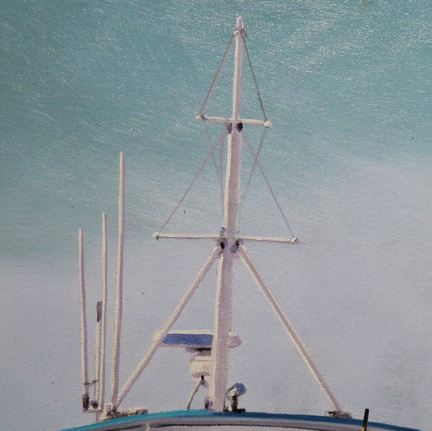
Here is a detail of a boat reflection that I stopped to tackle. Again, I knew I was going to do this when I got to it.


See the bluish strip along the bow of this red boat? The red is reflected, but that strip is not. Actually, the boat didn't actually have the strip on it, but I liked how it gave it definition and a more crisp detail.

So, here is the reflection of the strip painted in.


There is a lot of glare on the canvas surface from my flash, but you get the idea.


Again, my palette working at this stage.


I just kept going touching up, cleaning up shapes, altering colors, looking up at the objects and down at their reflections until I reached the other side. Many of these reflections are quick brush strokes using a twisting action with the brush, trying not to be too perfect.


Now that I was satisfied with the reflections (you have to make yourself stop), I was ready to move on with the touchup on the sky. I knew when I painted the lighter area of sky that this point would come where I had to match the color and value of the sky next to all the stuff in front of it. So, I made sure up front that I was only using Cobalt Blue and White. That makes this part so easy!

I placed a chunk of white and small squeeze of Cobalt Blue on my palette. I grabbed another palette than the one I had been using because I knew it was perfectly clean/dry and would not discolor the paint I needed.

 Just a small dab of blue makes a big difference to the white. The light sky stays consistent from left to right and top to bottom because I had mixed a large batch of it before I started painting it. The only change it makes is when it reaches the darker blue above it. There is a soft transition at that point, which makes it more difficult, but not impossible.


So there I went, from left to right, touching up, defining, etc. One problem I have in Costa Rica, which I also had some of on the Texas Coast, is bugs! Those little suckers love to fly right into my wet paint. Throughout the painting process I am picking them off and making small touchups.

Where I am now, not only do I have bugs, but this darn studio ceiling is made from cane with a tin roof covering. No AC means leaving the door open for air and a fan constantly blows on me. There is all this tiny little stuff that falls from the ceiling, plus the dogs, who love to lay under my tables while I am in here, shed little hairs which the fan promptly blows all around.

Thus, this is the stage where I carefully go over the whole painting and look for anything foreign in the paint. It took a couple of hours to go across the painting touching up the sky and getting rid of trash.

It is such a good feeling to stand back and say, " It's now ready for my signature!"


I always use the same signature. The larger the painting, the larger the signature. I have developed a series of brush strokes that create this particular one. You can see that I stayed far away from the edges of the canvas. That is because about two inches of canvas will go around the final stretcher bars that my son, Robby, will use when he receives this piece for display at the Felder Gallery.

I'm a big believer in having your signature show. Maybe its my marketing background, but when someone walks into a room and sees one of my paintings I don't want there to be any question about who the artist is. That type of "branding" is important to an artist, and should be important to the collector as well. A buyer who doesn't like the artist's signature to show should buy a photograph.

So, here's the final painting completed and drying in my studio. The photo isn't that good, but it does show the whole thing at one time. I hope you have enjoyed reading about this process and seeing the results. I'll be coming back soon with another one.

Meanwhile, "Pura Vida!" as they say in Costa Rica.


Monday, March 28, 2011

1h. The Final Details

I had a board member from the Rockport Center for the Arts come up to me during a show in which I had one of my paintings. She said, "Larry, how in the world do you do all those details?" I remember being a bit speechless, and said something lame like, "Very tricky thing, those details."

I'm not sure what people expect to hear when they ask that. I think they are just being nice. There isn't a good quick answer to that question. Maybe I should have said something like, "A lot of hard work!" 

I'm sure she really didn't want me to take the rest of the evening standing with her in front of my painting and actually tell her. Doing details takes patience and planning. Artists come in a wide variety of personalities. While some are willing to slave away for weeks on a piece in order to achieve a certain level of detail that they love.

Other artists might achieve something they love in a single brush stroke. They may or may not have patience and an ability to plan. The "single stroke" artist might only be choosing not to use those skills, yet use them in other areas.

So, you can't draw any conclusions about artist's abilities in this regard. But, I will say that "patient" artists are the ones painting a lot of detail.

The funny thing is, I don't consider myself an artist that goes crazy about perfection in my details. I've mentioned this before. I do just enough for the viewer's eye-brain functions to make up the difference. I know I could spend many, many more hours getting every little brush stroke perfect. I could use a very small, fine brush and paint in every word on every little sign in the backgrounds. I think it a waste of my time and non necessary.

In this post, I am painting some details on the painting I have been working on. I have brought the water up from the bottom; and brought sky reflections down from the top. If you missed it, read my post titled, "The Wet Look," which will bring you up-to-date.

PLANNING SKILLS

I have several details to show you that fall into "planning skills." Not everyone is a "planner." No everyone knows they are not a planner if they are missing those skills. But, you "planners" know who you are. You are constantly talking to yourself about why another person can't or won't "plan." You know for a fact that if they planned better their lives would be much better.

Yep, but I hope you don't verbalize this too much to them, because it will get you nowhere with the "non-planner."

Planning can happen as you go. I knew as I went along with the first round of painting this piece that there were things I would come back to later after everything was dry. Now, it is time to do just that.


POLES
(and I don't mean people from Poland)

This particular detail of poles runs across the whole painting. In my mind, it is a compositional element of detail that helps tie the painting together horizontally, both in design and in color.

I'm talking about the poles standing up in the "party" fishing boats, those boats that take out a large group of people out into the Gulf to fish the reefs. The boat mates use these poles for various reasons, helping the fishermen with lines, etc.

I think the poles create a rhythmic element to the composition, but they were a bit lost in the photos. I thought I could bring them out by painting them in a golden brown, almost like varnished cane poles. 

One reason I waited to paint them brown is that they cross over so many details that are painted grey. It was a lot easier to have them match those colors, differentiating them with value (dark and light) instead of color. If I had painted them brown, that wet color would have been picked up numerous times in the paint I was placing next to, in front of, and behind the poles. So, I waited for them to dry, which now makes it easy to go back over them with a different color.

Here is how they looked before I painted them brown.


and here they are painted brown. See how they give life to the boat? I don't care what color they are supposed to be. They look good brown. King's X.....Artist's license!

Here's a closeup of the pole. It took three brush strokes of different colors to make this. There is a light brown highlight on the left side, a pure brown (Burnt Siena) in the middle, and a stroke of dark grown (Van Dyke Brown) on the right side for the shadow. There are twenty of these across the painting. Everything is dry in these areas, so I can rest my hand on the canvas to steady it in order to make these long lines without screwing them up.

The original photo shows black tops to all these poles, so I will go back and add these once I'm done.


 If you are wondering how I get these nice lines, here is a photo that illustrates why I use a number two flat nylon brush. If you just let the paint flow off this sharp edge without pushing too hard, you get a fairly consistent line.


You can see the thin edge of the brush loaded with paint. Unlike "round" brushes, this one will give a fairly consistent line. You do have to often flatten it out on the palette each time you pick up more paint. Your eye has to be right there looking at exactly where it is moving.....and your hand had to be steady. Easier said than done, but it gets better with practice.

Here are the grey poles on the Pelican.


 Now, here they are painted brown.


In this case, my plan worked out very well. I like that the brown poles act as little warm lines amongst all that cool (bluish) boat color. In fact, it sorta picks up a little of that background landscape color in this view.

THE POLE LIGHT

There is another detail I planned for. The street light on the center pole.


This is a closeup the top of the pole without the light. There was no light in the original photo and I thought it needed one. You can see here how I painted the pole itself with brush strokes going from light to dark to give it depth. You can also see the tip of one of the boat's aluminum poles in the lower right corner of this photo. I will come back and touch up these ends when I touch up the sky. Planning...

Here's the whole pole without a light.


Here's the pole with the light painted in.


I just made this light up as I painted it in, but I had it in my head. I wanted an "old-fashioned" lamp look. There are numerous poles in this scene and this tallest, center pole needed something to stop taking your eye up and away from the main subjects! 

Putting this element on the pole stops your eye and sends it back down towards the boats. It points back into the composition in the same direction as the boats point.


Since the light on the pole wasn't in the original photo it wasn't traced to locate it. So, I had to remember to put the reflection in the water..... before I forgot about it.


After I took care of the things I had planned for, I started on the rest of the details from left to right. Anything that I ran across that I thought might need a little touchup or definition. Also, looking for any small areas of raw canvas that I may have missed. I found several.

Above is the mast section of the Gulf Eagle. All these boats have fairly thin antenni on top. I always make these thicker than they really are so that they show up in the painting. I also rarely put in any thin cables since they don't show up well. I did put in a few in the above rigging though. 

The shadows on these white objects have a lot of violet in them. Violet and purple are colors that many artists are afraid to use, yet they are in nature if we look close enough, particularly in the shadows. I often add violet to blue for shadows. Its a very old trick.


Here is my palette I have been working with on the details. Artists can get crazy over what colors to include in their palette. If I know I will be mixing a large variety of colors, like I needed for touching up details, I will go ahead and place many colors on my palette. j

If I know I am only going to work on a certain area of color, then I will confine my palette to only those colors. I can always add a color or two while I am working, which I often do.

What amazes me is the amount of White I use. A large tube of Winton's Soft Mixing White weighs 6.75 ounces. This eight foot painting has close to two full tubes of white on it. The white paint is also the last to want to dry. Because it is not as opaque as it could be, I have to go over the pure white areas several times. If i do this at the end of my painting, I may have to wait four or five weeks for it to dry, depending on the thickness. 


I am happy to say that I am about to complete this painting. I started it at the beginning of January and this is the end of March. I will finish this painting in my next post by putting in the rest of the water reflections, touching up the sky and painting on my signature.

I leave you with a photo I took this morning in my back yard.....the beach. I was sitting out in my lawn chair enjoying the tranquil sunrise as a thunderstorm rumbled to the East. The edge of the storm made some nice reflections where the sun hit it. 

Life is good on the Central Pacific Coast of Costa Rica!

Monday, March 21, 2011

1g. The Color of Water

When looking at water across a harbor, you are looking at four basic elements.

First, you see the reflection of the sky or clouds on the water. Second, there is the reflection of any objects in front of you. And third, depending on the amount of wave action, you might see something reflected that is actually above or slightly behind you such as the sky. And that sky can be totally different than the one in front of you. If you spend some time staring at water, you will see what I mean.

But, as you look from the distance down towards where you are standing, at some point you are looking into the water and not at a reflection. That water will have a color. In Texas, that color is usually a shade of green, unless you go into deeper water offshore ("where the sun don't shine".....onto the bottom that is).

As long as I am on the subject, I'd like to cover something less thought about.  Lets say its a sunny day and you are out standing on the dock. You might be looking at how the reflections are working across the water. Then, you observe the water near you and see that greenish color as you look down.

But wait, look what the sun does when it goes into the water. It makes shadows on the greenish dock posts and bottom objects in the water. Yes, there are shadows and highlights under the water too. If you are really good, you can show reflections from a light source above the water, while also showing what is happening with the light under the water. Hmmm. Nice.

Texas water really isn't green, any more than water in the ocean is blue. Water is clear, but can have particles suspended in it, like dirt (mud) stirred up from the bottom. Then, it takes on a muddy brownish cast. 

But, in a Texas harbor there is a lot of algae in the shallow waters, because algae needs sunlight to grow. So, when the wind is calm for a day or so, and all the particles have settled, the water takes on a greenish brown cast because it is taking on the color of the bottom and/or sides of objects under the water from where you are standing.

So, when I have a large area of water at the bottom of a harbor scene to paint, I like to add in some greenish color as if you are looking down past the reflections and into the actual water. When you look towards the other side of the harbor the reflections cover up the color of the water.

But, there's more! What happens when the object of that reflection is in shadow and isn't lit by the sun? It is a dark reflection and you see a greenish cast. What is happening is that the reflection isn't bright enough to cover up the color of the water. 

Reflections need light to keep their color!  You can see how I am compensating for that in the photos below by how I mixed in some green on these darker reflections. These greens will compliment the greens I will add in at the bottom and make a more harmonious painting.


 I will be able to play with these shades of green when I place these reflections back on top of the lighter sky reflections.

Next time you go down to the harbor, look at the reflections. You will see the green just as I have described. So water reflections are not just a mirror image of the objects? Uh......No. They have a life of their own!


Next in the progression of creating convincing water in the harbor comes the slow darkening  of color towards the bottom, creating more shapes and definition to each wave. I'm working in some darker blue, and putting them just under the lighter brushstrokes I had made earlier. Its the beginning of more structure in the water, but far from finished at this point.


Using my large brush, I roughly swipe the dark blue and then with fast, long strokes, blend it in to the lighter blue paint under it, until I get the darkness I desire. You have to know when to stop. Less is more here. You can always darken and blend a more later.


I will usually darken the lower corners a little more than the middle. Its a composition thing that leads the viewer's eye toward the center of the painting. If I do all this right, the red boat in the middle of the scene will be where the eye lands first. A dominate spot, not only from color, but from other aspects of the composition.

So now, remember that blue sky reflection color that I mentioned earlier? The one I thought needed a darker blue because it was too light? Well, now its time to put in the darker blue. It was too light. it doesn't take too long.


I use my small, number two brush for the tight areas and then switch to the larger, number four.


That's done. It pretty much covered up the darker blue strokes I had made earlier, but I was getting the feeling for it all, so no loss really. Darker strokes like those will go back in soon.

Now I want to start putting in some green along the bottom of the painting. The green that comes from the looking down into the water. There is a transition to this as the reflection hangs on as long as it can before letting go and allowing the water to take on the full color of looking down into it. 

I need to mix some green.


I start out by putting a squeeze of Olive Green and a squeeze of Chromium Green Oxide into my can. I had a little blue left on my knife, so I pulled just a little from both greens to see what kind of color I would have when the greens were exposed to the colors which are already down on the canvas. I liked what I saw initially. The Olive Green is so dark from the tube, its hard to see what color it will give when mixed.


But, when I mixed them together, the Olive Green was powerless against the Oxide and didn't darken or tone it down like I thought it might. The green was too bright –– too green. I needed to muddy it up a bit for it to look real. So, back to the color wheel. A little complementary color (the opposite color from green is red) is in order. Now how much to add?


That looks about right now. I could grey it more, but I see this painting as being pretty colorful and dramatic. This dark green paint will lighten somewhat when I start applying it to the existing paint, unless I wait for the paint to dry, which makes it harder to blend. I'll talk about paint drying another time.

For now, I am starting to add in the green.


I use the structure I have already created with the dark blues along the bottom.
Some of the dark blue will still be there as long as I don't use too many brush strokes to smooth the green into the wave.


I work from the bottom up and make sure the strokes that are getting close to the boats just barely show up with a hint of green. Everything is still wet, so just an extra stroke often does the trick.

Next time I will continue this process, adding strokes of light and dark until the water looks right to me. After that I will do more to the boats and backgrounds and work a lot of the object reflections back in over the water.

That's when the "Magic" happens!


Sunday, March 20, 2011

1f. That Wet Look

Well, that's what I'm working up to. That Wet Look. At least that is what I am trying to achieve. Sometimes I can pull it off better than other times. Each time I paint a painting with water that should look wet, I gain just a little more experience at it.

The technique I am using on this painting I have used before and like it. But, its not for every situation to be sure.

Last time I was bringing up the darker green shapes up towards the lighter sky reflections.

Now, I want to add some medium blue shapes as a transition from the darker greenish waves up towards the boats. I need some blue.


So I squeeze out a chunk of Soft Mixing White and a smaller squeeze of Prussian Blue.


Its looking too dark, so I need to add a little more white.


That will do it, even though I'm not sure these photos are showing this correctly. Trust me. Its lighter. 

This shows how I am bringing this blue up. Quick strokes of the medium blue across everything. The light blue paint is still very wet, and pretty think under these strokes, so you can't really go back over them very easily. I only do so very lightly, especially when the brush stroke it too large and noticeable. 


Here is how that is looking for the moment.

Once the medium blue shapes are in place, I will go back to the dark green. They need more power! So, I'm mixing some dark green again.


I'm using yesterday's tin can, squeezing Chromium Green Oxide, Olive Green and some Orange.


Now I have the dark green similar to what I had been using.


Like I had done before, I rough in the dark green wave shapes. This is where I must be careful to not create any unusual places in the water that would draw too much attention. The viewer's eye must go to the middle of the painting first, then roam throughout to get the right feelings of being there. Thus, as I create these wave shapes, each one has to be different from the others, but not so different as to draw attention. 

Some end up being connected to others nearby. The one above the other can't look like it is duplicated. It is almost like laying a stone wall. It all has to fit properly, plus be a comfortable design. I will be on the lookout from here out for this, and will think nothing of making the correction if I see it.


I decided that within the can I should have several shades of this green to work with, so I added some white to one side. This will allow me to make the blends between the green shapes and the blue shapes. The green dries faster than the blue/white paint, so my blending ability has diminished this morning. I need these extra shades of green primarily for that reason, almost as if I am wetting it all again for blending.


Once I like their positions, I take a large soft brush and start blending them to get rid of the hard edges.


I do this across the whole bottom of the canvas. But, what is happening is that in doing this blending, much of the blue sky reflections are being covered up partially by the soft green fuzzyness of the blend. Its starting to look too dull. But, that is the beauty of oil paints, there is nothing that can't be fixed and painted over. This is all part of the process and should be expected. No big deal...... Hello blue!


Now that I've gotten my deep blues back, using broad strokes of thick paint with my large brush, I need to modulate the blues a bit to add some wetness. So, went back to my light blue can and found the paint to still be fairly wet. Using my small brush, I added the light blue into the deep blue I had just painted.


I tried to imagine the blue being the tops of the waves at the bottom. That means that these little light blue highlights are actually reflections of the light blue portion of the sky in the distance.


So, here is where I am at now.


The foreground is starting to carry its weight, even though I will most likely go back into it after it is dry for some final touches. There is a pretty good transition of water from top to bottom. The waves look larger and closer to the viewer as they go down, thus the perspective is working. 

The middle of the painting is starting to take on a glow. This will be a very dramatic painting. I do both serene and dramatic in my work, but usually its the dramatic ones that people are drawn to. Compared to the original photo, this image now has its own rich color and its own dramatic water. The painting has left its photo behind and has moved into new territory. The difference between photo and oil paint.

I will let the water dry before I touch it again. At least dry enough so that my brush won't dig into it when I paint on top of it again. That might take a week or so. 

I have moved my canvas down so I can comfortably paint in more in the area of the boats and background that I had saved for later. Once I am happy with that, I will bring the reflections of the objects back down over the water. That is my favorite part. Paint flows so easily over dried paint, so I can move fast and paint many colors off my palette at once.

I'm thinking about what I will start painting next. This one is pretty much done in my mind. I know how it will turn out. I just have to spend the time finishing it. Right now I am thinking about painting a Brown Pelican....large. I haven't done a bird in a while and I have a great reference shot I took several years ago that has been begging me to paint.