

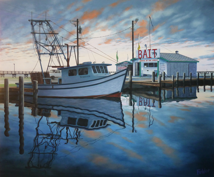
Finished painting: "Morning Reflections"

Photo references on my iMac.
Wanting to create another harbor scene, I was looking to do something different, maybe a bit more challenging to paint. So, I decided to do an oil painting that combined a drab photo for the objects in the harbor, with a photo of a dramatic, colorful sky. You can see above what I mean as I was looking at them on my iMac side by side. I decided on a 40" x 48" size and stretched a canvas. Mine are always "gallery-wrapped"with a thickness of 1.5 inches, so I have to paint the sides of the canvas also, just continuing the image on the front.

I divided the canvas into 16 squares that match those I placed over the photo on my Mac. Then I just sketched in pencil to "scale up" the image. Here you can see the beginnings of the colors. These are the colors to the very back of the sky elements, so they go on first. These are meant to peek through the coming clouds, and they have a lot of white in them since the sky in this painting is brighter in the distance.

Now I am putting in the darker clouds closer to the viewer. The angle of the clouds is part of the perspective going towards the horizon line. The light yellow and pink sky in the distance shows that the Sun is on its way up (okay, I know that its just the Earth rotating). This light will be very key when I start putting in the reflections.

In trying to create more realistic clouds that looked more like my reference photo, I used a large brush and articulated the lights are darks.

Here you can see how I am trying to control the reflections. I placed my horizon line just above the vertical center. I added the red light on the clouds and wanted to do a fairly accurate match on the reflection. This was going to be one of my harbor scenes where there is basically no wind. So, the reflection will not be broken up by waves. It will just undulate up and down with the occasional landing of a bird, or the movement of fish below.
So, I let the sky dry for a couple of days and did a loose tracing of where the dark blues and reds are located in relationship to the horizon line. Then, I flipped the tracing and transferred it to the water exactly the same distance from the horizon line. This way I won't have to worry about getting things in the right place. The movement of the water might move a reflection a bit from side to side, but it is generally in the same place as its counterpart above.
I know that most of this paint will be covered by the objects I will paint over them. But, still I want them to be there in case an area shows up that needs that reflection, and that I had not anticipated. Its not that big a deal just to paint them in. I also started putting in the dark along the bottom.

This is the result of bringing the blue up from the bottom, leaving some of the red where it goes, and adding the white of the clouds to match the sky. At times I turned the canvas upside down while I painted the reflections on the water. I can come back later and make some changes if I want, like maybe changing the color of the water on the horizon, depending on all the other elements. I don't have to decide yet, because most of it will be covered up.

Here is a better view of the original photo I took one early morning at Fulton Harbor on the Texas Coast. As you can tell, this is a very overcast day with just a touch of wind. All I need from this photo are the details of the objects, which I will pick and choose from. At this point, I'm not sure how it will turn out. But, my intension is to make a very dramatic painting. I have the general look of the scene in my mind, because I have seen many early morning harbor scenes at this location. Lets see where this goes.

Having relocated my pencil marks from scaling up the photo of the harbor, I sketched the basic elements where they went.

Here the boat and building shapes have been "under painted." Most of this paint will be covered up with more paint as the painting develops. I just want to start seeing the shapes and darks and lights that will work with the new sky. I am only looking at the harbor photo for details and have to make up most of my own color and brightness for the very different sky than what the reference photo is showing.
Here are the two reference photos again.

And here is the palette I've been working with. Colors are: Prussian Blue, Cobalt Blue, Lamp Black, Burnt Sienna and Indian Red, with Soft Mixing White.

I started adding in the docks, giving them some warm color just to contrast all the cool blues I have on the objects.

Now, I have added some green trim to the bait stand and started painting the letters on the large sign. I put in the dock on the left of the boat and roughed in the wooden trawler doors sitting on the back of the boat. I also put in the telephone poles and some flag poles as well.

Here's are the signs with the initial type painted in.

Part of a white pickup truck in the background. Just quickly roughed it in and it will probably stay that way except for a touch of pure white after this dries.

Well, now I had to work on lighting this thing. Obviously with this sky, the objects are going to have to be "backlit." The side facing the viewer will be in shadow, and that means darker, cool colors dominated by blues, purples and black. So, now I am starting to paint over areas that I know are in the most shadow, such as the side of this building. I want to get this as close as possible before I start adding in the details.
In this view, you can see that I am adding in a little reflection on the water as I go. I have some basic black coming from under the dock, but haven't put in the pole reflections yet.

I decided to move on over to the boat and start putting in the boat reflection. That will give me some idea of the balance I needed from side to side. But before I did that, I darkened the boat a little. I can always make it darker. I also roughed in the rigging above.

Now, I'm back over to the other side of the painting to put in the post reflections. I like to let paint dry for a couple of days before I start painting over it with something new, so by moving to other areas I can let the other side start drying and come back to it later. Here I have outlined the reflection, measuring the length of the reflection with my brush handle. Just some slight wiggle in the image gives the idea of moving water. You have to do that to everything. Because the posts are right on the water and you can see where they meet the water, the length of the reflection is the same as the post.

Here is the completed post reflections. You can see that I altered the dock reflection to make it match better before bringing down the rough reflection of the side of the building.

Looking at the whole panting I'm starting to see how its going to work. It has the drama I was looking for. Now I have to add in more details and reflections. You can see that I haven't put in the "BAIT" reflection yet. But, all this is subject to change as it develops. Nothing is sacred.

Moving to another area to work on, I put in the ropes, pulleys and additional welded metal of the superstructure. I'm keeping it dark to contrast with the sky. Normally, I would add highlights to shape these parts, but the darkness would be more accurate to the human eye looking into the bright morning light behind.

Now I have the drop shadow on the sign in and have put in the reflection.

I added the reflections of the ropes and pulleys on the boat.

Since my reference photo had lattice I put it in, simplifying it to the basics. Some of these brush strokes came over the poles, but I know I will go back over the poles later anyway.

I had been putting off giving some detail to the wooden trawler doors, so I sketched some details on tracing paper and taped it above the area to follow.

Here it is with new form. I will come back later and reduce the intensity of the browns with some blues.

Electrical stuff going up on the poles. Just quick strokes and a hint of detail.

Flags joining them. Unlike the reference photos, they are slack due to no wind.

The secondary building gets its details.

Here's a full shot of the piece at this point. Still more detail to put in, including the fishing pier that goes behind it all.

Boat looked too bright, so I decided to darken it. I can take it back up a little if I need to later. I put in the registration numbers on the side of the cabin, along with the cables connecting the bow to the superstructure.

I used a steel rule to draw the pier in. It is going across the frame, but also reduces in size each time it peeks out from the back due to perspective. Normally I would have lightened the paint as it went into the distance, but I like the contrast it gives with the bright sky in the horizon.


I used a steel rule to draw the pier in. It is going across the frame, but also reduces in size each time it peeks out from the back due to perspective. Normally I would have lightened the paint as it went into the distance, but I like the contrast it gives with the bright sky in the horizon.

Time to back off and look at it as a whole. I think I darkened the boat too much, and I still have more details to put in. I think I will just add some more light to the front of the boat and see if I like that better. There will be a point in which it will look just right. I'm just not there yet.

So I lightened up the hull, fading off the light towards the back of the boat. I also had to lighted the water reflection a bit. Now I have to lighten up the cabin facing us a little to make it match better.
Now that is done and I can back off and take another look overall. There are two areas that need work. One is the background on the far left where the pier is. There is detail I haven't put in yet that will sharpen up the background. The other is the bait house. It just needs more life to it.

Looking closer, I decided to create warm light coming from inside the two buildings, as if the bait stand is open for business, but no one is there yet to buy bait. You can see here where I started adding warm light on the screen door and a counter just to the inside. Also added a warm-looking something in the left doorway, maybe the side of a fridge.

The light must be coming from the ceiling since the screen door shows the angle as the light falls on it. I started adding objects inside the door on the wall, as well as indications of light in the windows. I had placed a white box on the window where I will paint the "OPEN" sign with orange over white when the white dries. You always have a to plan ahead when painting in layers.
I also added some warm light on the ground in front of the doorways, tying the inside with the outside. The warm light spills slightly on some of the objects in front, such as a fine line of orange on the dock posts closest to the doorway.

Here's a closeup of the warm light with everything in. I think this gives some extra excitement to the painting. Overall, the painting is very blue and this spot of warm light acts as a focal point and contrasts well with the cool blue morning light. My intention is for the viewer to first enjoy the overall serenity and beauty of the early morning reflections, and then get pulled into this little bait house. This is one of those boat paintings in which the boat is not the main subject. It certainly adds greatly to the reflective objects, but it is in shadow to the point that your eye passes it by for the more interesting details of the bait house.

Well, the value of the boat cabin was still too dark for me, so I made another adjustment to it. I had to also lighten the front window area of the cabin, which I think helped overall. Okay, now I'm happy with the boat lighting and I can move on. I tightened up the details on top of the boat and darkened the wooden trawler doors on the back as well. They were just too bright. I dragged some blues over the brown wood, and then added more light to the rusty smoke stack behind the cabin.
At this point, I am looking all over the canvas for areas to add a little touchup here and there with whatever color of paint is on my palette at the time. This is the beauty of painting with oils, its not over 'til its over. Sometimes the need for paint to dry before adding more paint gives the artist more time to ponder over decisions and get it right.
My living area is also my studio, at least one end of it, so I live with my work and constantly look at it from a distance throughout the day or night when I am not painting. That gives me the opportunity to consider what else to do with it. Sometimes I see something that would make it better, and sometimes I simply see a mistake, like maybe not remembering to add a detail to the reflection that I added to the objects above.
Another thing I like to do when not painting is to look over at the piece in the evening when the lights are low. I want to see what it would look like hanging on someone's wall with low light. If I've done it right, the painting in low light will still work. In this sunrise scenario, you can almost see the sunlight increasing as you add more light to the room.
I am well on my way to finishing this piece now. I have a deadline for some friends taking it back to the States and it needs to be dry before I unstretch it and roll it up in a tube for transport.
Its somewhat of a "shocker" at this point to review the original photo I took for reference. Creativity comes in many forms. It shouldn't be confused with skills and craftsmanship. Skill and craftsmanship would be painting an exact copy of this photo. The creativity comes from using reference and going on from there using your imagination.

Now what am I going to do about the left side background? In the original photo there was a building at the beginning of the pier that I cropped out. I think I will bring it into the composition in order to stop the viewer's eye from being drawn off to the left by the pier. The building should stop that like a pinball bumper.

There's only one way to do it, start with a brush stroke. I loaded up some color, similar to what I have been using on the other buildings (Cobalt Blue, Violet and Lamp Black), and placed the right edge of the pier building over the existing pier.

Here's the completed pier building. I took this photo from the side of the canvas to show how I like to wrap the image around it. You have to be careful how you continue your lines, particularly when they are at an angle, like the roof here. I try to envision the height of the painting when it is hung. The angle of the top of the roof looks right from this view, but if you look from a higher or lower angle it looks wrong. You can also see how I added a bunch of pilings for the foundation of the building, as well as some shadows under. Now I have to work on the ground between the building and the boat.

I replaced the water with a new version and lowered the horizon line to work better with the pier. I had to make sure the horizon on the other side of the painting matched. Then I painted in the top of the bulkhead, the grass across the parking lot, changed the color of the parking lot and then put in the grass in the foreground. I have been at this location many, many times and know what it looks like. However, I left out some obnoxious yellow posts that clutter the site so cars won't park on the grass.

I moved on over to the other side of the canvas and painted in the white plastic pipe that extends into the water for the live well in front of the building that holds the live bait shrimp. You can see that I also painted in a little shed on the side of the building. That large flat area was bothering me. Oh, you can also see some weeds I placed around the base of the building too.

While I was at it, I tightened up a lot of details in this view, including making the light travel farther on the ground.

I had postponed fixing the bottom red paint on the boat until I saw how it would react to the other changes around it. Now I like it. You can also see the white reflections on the hull from the water, which gives it some extra life.

As my collectors know, I always put in one single bird in my paintings, and it is often the last thing I put in. I like to use the common Laughing Gull which thrives on the Texas Coast. I guess its a personal thing, but putting in a lot of birds is just a little corny to me. So my one bird represents many. Now I have to decide where to place it. I think I will put in on this post because it will show up nicely in front of the dark wood of the trawler doors behind it. While I am at it, I will put in the rope from the post to the boat and its reflection.

Here is the finished bird and rope detail. I kept the rope fairly dark and in shadow, but allowed light to fall somewhat on the bird. Except for a few touches all over the painting, this is the last of what I needed to include.
And this is the final painting, although a photo rarely does these justice, and the color depends on each individual monitor. There is nothing like viewing an oil painting in person because of how the light reflects through the layers of linseed oil with color pigment suspended within. Anyway, if you have made it to the end of this post, I commend you for hanging in there, and thank you for your interest in my work.
This 40" x 48" piece is now drying and will make the journey to the Felder Gallery in Port Aransas, Texas later this week. Now to figure out what to paint next... I think I might do another large one, maybe an eight-footer, since the last one of those I did sold before it was even hung. Nice!
I am curious whether it is better to divide up these painting posts into two or three parts over a few weeks as I paint, so that each one is not so long. Or, is it better to keep it in one post where you can follow it from start to finish. Comments are welcome.
I like the long one. But, give us the finished piece at the very top before the breakdown. This is a great post!
ReplyDeleteI just want to say one thing that is you are a great painter thanks for sharing this great post
ReplyDeletePainting Company